Graphics design level 3, project 4
Music and Projections

At the start of the project, I wrote about how I thought the project was going to go, expecting the project to be a lot more fun than what it was. Like I said, I wanted to satisfy my clients requirements, however my ideas ended up being not looked at or used, apart from the animation which I'm not sure if they used or not. However we can hope for the best. I liked the project, but I still think the project could've been done better if I was able to switch groups since I was unhappy with the people I was working with in Graphics, but the group in the 60's are lovely and I'd definitely work with them again.
I found it fun to try and animate even if the thing was basic, it's was fun.


I then moved onto research for advertisement and which I went to IKEA and Airbnb for companies and Gorillaz and Miku Expo for bands, as well as Boomtown, as seen below.
I used these companies and bands since they're bands I know and love with excellent visuals which I love to talk about in detail.
And the companies are places I know, with impressive advertisement campaigns, especially since IKEA isn't scared to step outside the box with their advertising campaign, with their bizarre ways of advertisement bringing people into the shop for their low prices and nice furniture.
And I have never used Airbnb, but the ads are still good regardless of the controversy and dangers around the app.


I then moved onto Boomtown, a large space festival which is supposed to be looking like a city with themes around the genres they're performing in. I moved onto this piece of research since it had a large variety of themes and aesthetics over the years, changing the place progressively changing to fit the storyline. While boomtown didn't come in useful on my project at the end of the day, it was still fascinating to research and find it's origin.

After my research, I found out my decade, which was the 60's. I was unhappy about it at first since the 60's isn't in my music taste, and still isn't. However I do like the vibrancy the year had.
I used this time to research bands and the things that happened within the year. Including the start of Doctor Who's long run.
Turns out the 60's, like most of the centuries, had a lot going on.


Of course I couldn't talk about the 60's without mentioning the one and only Beatles. This band made the sixties the sixties. You can't think about this century without the 4 British boys that had the world on chokehold. This band was useful to look at since the Beatles was inside of the of the song list. Especially with the large selection of merchandise, music and films which I do go back too in my research.
However, you just can't research the sixties without this iconic group.


Continuing onwards from my research I went onto other notorious bands of the decade like the Who and the Beach Boys. While they haven't had as massive an impact as the Beatles, they're still important in the ways of showing how big an impact English bands had at the time, since the most popular music at that time was from England. This research was important since it gives me a baseplate of how to start things like the logo and vibes that the band will most likely go for with the logos and for the other things we have to do.

We then went onwards to do some observational drawings, which I based on the sixties with toys and things used at the time. As well as trying to recreate some cartoon styles however, I think I can take my fair guess with the fact they don't look that great.
The favourite thing that I drew was the yellow submarine, mostly because of the colours and vibrancy of the illustration.
I didn't have anything from the sixties to bring in to properly illustrate however, luckily, there's plenty of 60 things to illustrate online! Lucky me.


For the trip I went all the way to Sheffield for things like the Museum of Video Games, which helped with animations for certain centuries.
I loved going around this museum, especially since my favourite video game was in there at the time. It wasn't exactly suitable for my century however, it was fun to go to.
I'd definitely go again if given the opportunity.
We also travelled all the way to the Millenium gallery to take a look at the things people were selling for ideas of merchandise, my favourite thing from the shops was a pair of earrings that were dangling the character toad from Mario.
But I found the trip useful enough and enjoyed it.


Afterwards I decided to delve into more research on the 60's by going back to the Beatles, said I'd go back to these.
The Beatles made these films so that they didn't have to go on tour, since they didn't like being chased around by fans, and not being able to hear themselves over fans screaming over them, which made such cinematic masterpieces like Yellow Submarine, which wasn't voiced by the Beatles, but approved by the Beatles.
This was especially useful for my animations to see how they made animations in the sixties and take notes.


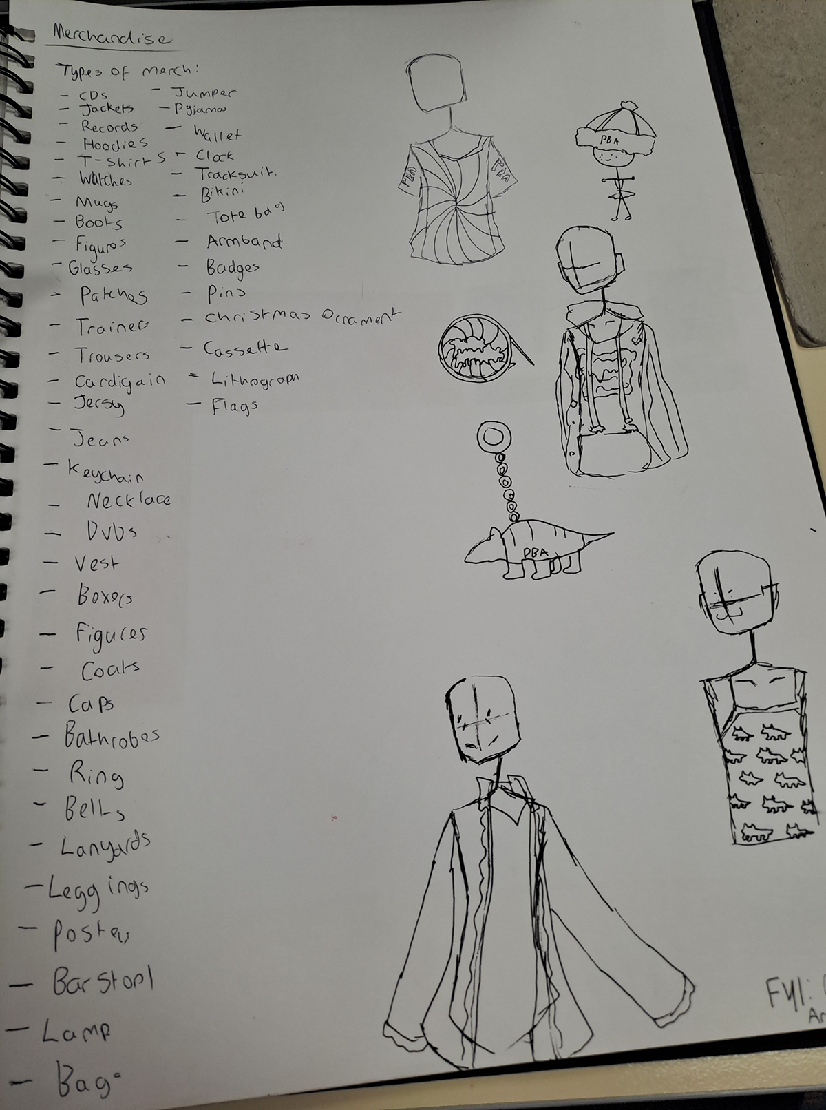
These are the logos are all 60's based, The first ones are from before I knew who the band was, They were eye based since they're my favourite things to draw apart from people in general.
After meeting the band the views on the logo changed with animals, like the Armadillo in the logo. However, I was slightly behind the other people in my group since I was out ill on the day we met them. Which is definitely, not convenient for me.
My favourite logo is the one next to the jellyfish. It was the decent looking animal.

This is my group crit about my hand drawn logos. I then moved on to making a digital logo that has nothing to do with my other logos, because in general I didn't like any of them.


This is the process of creating my nice nice digital logo. I looked around at Armadillos images seeing if there's any ideal images to help with my logo, I found a curled armadillo and ran with the idea. Since I thought it would be nice and different to the other logos, I kept making the outlines a different colour since It would work well with merchandise and shirt. Since it's minimalistic it works.

Final digital logos


I then went on to gather research on projections since I needed ideas for the animations.
There's a large variety of animations and methods of projection like projecting onto a man and onto a building.

And these are animation methods, honestly, can't say much else.
It shows the variety of ads you can do.


I then moved onto researching two of the biggest artists of the sixties like Andy and Roy this helps since it gives me something to work off with the animation since it tells me what is good for the artstyle.

This was the brochure I created. I used the same illustrated background as my advertisement and and poster and then continued to add the logo made by Katie and then adding the bandmate's names along with the instruments of those who supplied information.
This was my favourite

Final brochure page
TEXT BLAH BLAH

text message


Text abahahahahababa

Example of advertisement in place.

This is the poster for my print based outcome.
Sadly I don't have my research behind it.
But it still looks nice.
This is the animation I created since I had too.
It was quite simple since I cannot animate for the life of me.
I reused the same colours as my poster and advertisement, and made a ball go down a set line. It was one of my storyboard ideas, however, my storyboard has vanished since. So I sadly can't show you any of my other marvellous ideas.

